Computationally reproducible empirical papers

13/02/2023

A few years back I was reading a stats paper. It mentioned somewhere that the entire paper was computationally reproducible. In other words, there was a single script sitting on github that could generate the whole paper from scratch. It will do all of the simulations, plot all of the figures, and produce a pdf of the manuscript. This is a really important step forward for transparency – the reader can see exactly what analyses have taken place, and even change them to see how this affects the outcome.

I was captivated by this idea, and I started thinking about how to apply it to empirical work. Stats papers are one thing, as they can often be based on simulations that don’t require any external data. But for empirical studies, the ‘holy grail’ would be to download all of the raw data and do all analyses entirely from scratch, all automatically. This turns out to be quite a bit of work! However we now have some published examples of fully computationally reproducible studies (see links below). I thought it was worth putting together some notes about our experiences to hopefully guide others in doing the same thing.

Software

A huge advance that helps make computational reproducibility possible is the existence of markdown documents. The basic idea is that you can create a single document that combines normal text, images, equations, and sections of computer code. When the script is executed, the code gets run, and an output document is produced containing the results. The output can be in any arbitrary format, including html, pdf and word processor document formats.

There are also many different flavours of markdown. So far I have mostly used Rmarkdown, which is well integrated with the RStudio application. However there are similar offerings for Python (e.g. Jupyter and PyPI), Matlab (live scripts), and from Google (Colab). It’s also possible to execute code snippets from other languages within an R markdown document if required.

Markdown does a lot of the heavy lifting in combining the code and text underlying a paper. It also uses LaTeX as an intermediate step, e.g. when producing a PDF file. That makes it possible to import the LaTeX script into another editor like Overleaf, which I’ve found is useful for applying journal style templates. It also means that equations can be typeset using LaTeX, so they look how they’re supposed to look.

Storage for code and data

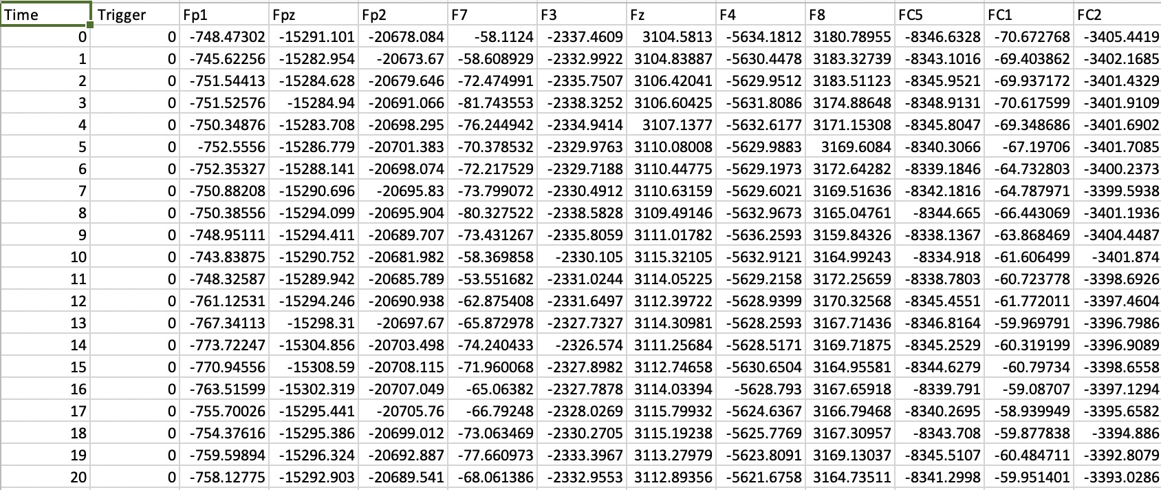
One important piece of the puzzle in realising reproducible empirical papers is how to automatically download the raw data. Github is great for storing code, but it isn’t really cut out for data storage, and has some quite harsh restrictive capacity limits for each project. It is viable for small data files, such as a spreadsheet containing data from a psychophysics experiment, or a questionnaire. But data files from studies using EEG, MRI, MEG, psychophysiology, eyetracking and other methods are often much larger, so including them in a github repo isn’t an option.

A solution I’ve found extremely useful is the osfr package that allows easy access to repositories on the OSF website. With a few lines of code it’s possible to automatically download files from any public repository on the site without needing any login credentials or access tokens (you do need an access token linked to your account in order to upload files). I think this makes life much easier for producing a fully automated script, because you don’t need to instruct the user to download a separate data file (or whole set of files) and put it in a specific location on their computer. Instead the script can grab whatever it needs and put it where it wants it, without any burden on the end user. I’m sure there are similar methods for other repositories, but this one seemed particularly frictionless. It’s also easy to link an OSF project to a github repo, so you can see the code in the same place as everything else.

A word of caution though – I have found that recently there is an occasional bug in indexing the files in some OSF repositories. Sometimes files are missed from a listing, though it’s not clear to me why this happens or what to do about it (see also this bug report: https://github.com/ropensci/osfr/issues/142). In the worst case, it might be necessary to manually download some of the data files, which isn’t exactly ideal. Hopefully this issue will be resolved by a package update.

Option flags to save time

Although the ultimate goal of computational reproducibility is that all of the analysis is done from scratch on the raw data, it’s not necessarily the case that everyone wants to do this all the time. In particular some analyses take several hours, and might need many gigabytes of storage space. I’ve found it useful to include a flag at the start of the script that specifies the level of analysis required. The current iteration of this idea has four levels:

3: Download all raw data and do all analysis from scratch
2: Do statistics, modelling, bootstrapping etc., but using processed data files that are smaller in size
1: Generate figures using processed data and the results of modelling (and other processing)
0: Don’t execute any analysis code, just generate a pdf of the manuscript with pre-generated figures

Using ‘if’ statements throughout the code lets these flags select which sections get executed. The flags turn out to also be extremely useful when writing the paper itself. For example you can avoid having to run analyses taking several hours when all you want to do is edit the text of the manuscript. It does need a bit of thought to make sure that processed data files can also be downloaded from the OSF repo if necessary, rather than forcing the user to go from the raw data if they don’t have the time (or the storage space). But overall this makes the code much easier to work with, and hopefully more straightforward for others.

Barriers to reproducibility

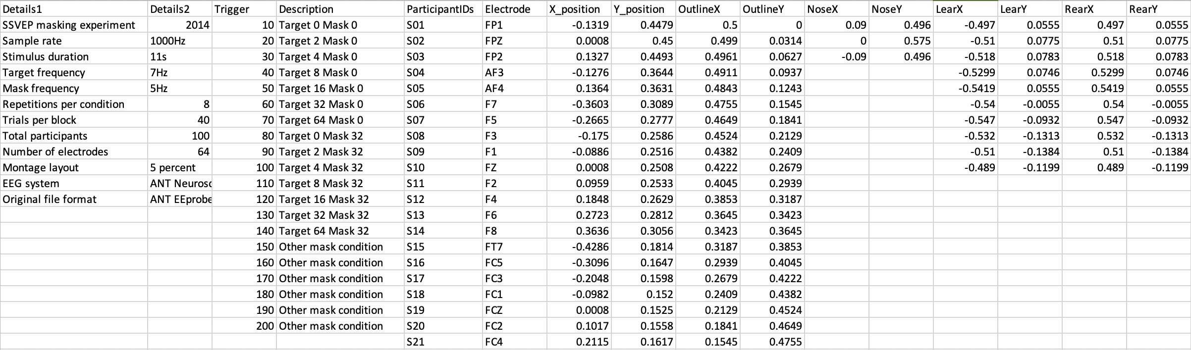
As with anything there are some limitations, for example some analyses use specialist software, and toolboxes that need user input, that cannot be straightforwardly integrated into a markdown pipeline. There are also restrictions on which data can be safely shared, for example structural MRI scans might plausibly be used to de-anonymise data if not processed appropriately before sharing. And I’m aware that writing bespoke analysis code is not everyone’s cup of tea, and is perhaps particularly well suited to certain data types (such as psychophysical or behavioural data, and SSVEP data). These caveats aside though, I think reproducibility is an important step towards a more open scientific landscape, and a worthy goal to aspire to.

Future plans

I was recently awarded some money from my University’s Enhancing Research Culture fund to pilot a project on computational reproducibility. The plan is to make ten studies computationally reproducible, using some of the methods described above, and also to push the envelope a bit in terms of technical skills. One particular goal is to start preserving the specific programming environment used, including all package versions (see this great paper for more details). Just like Nick Fury I’ve put a team together (of superhero PhD students) to work together on what I think will be an exciting project!

Examples of computationally reproducible papers:

Baker, D.H. (2021). Statistical analysis of periodic data in neuroscience. Neurons, Behavior, Data Analysis and Theory, 5(3): 1-18, [DOI] [code].

Baker, D.H., Vilidaite, G. & Wade, A.R. (2021). Steady-state measures of visual suppression. PLoS Computational Biology, 17(10): e1009507, [DOI] [code].

Baker, D.H. et al. (2023). Temporal dynamics of normalization reweighting. BioRxiv preprint, [DOI] [code].

Segala, F.G., Bruno, A., Wade, A.R. & Baker, D.H. (2023). Different rules for binocular combination of luminance in cortical and subcortical pathways. BioRxiv preprint, [DOI] [code].


Achieving isoluminance

26/07/2022

We’re setting up a couple of new studies as part of a BBSRC-funded project, where we want to present isoluminant chromatic stimuli. Isoluminant means that the luminance (i.e. the amount of light) of the stimulus is constant, and it only varies in chromaticity (colour). It turns out there are multiple ways of generating isoluminant stimuli, so I’ve been down a bit of a rabbit hole for the past month or so working it all out. I couldn’t find a decent ‘primer’ on isoluminance that covered all of these issues, so I thought I would summarise some notes here.

Physical isoluminance

In principle it’s possible to make any chromatic stimulus physically isoluminant by adjusting the output of the display device so that the luminance measured for each colour (using a photometer) is constant. Most computer monitors have three channels (red, green and blue, or RGB), which typically differ in their luminous output, with the green channel being brightest and the blue channel dimmest (see graph below). Scaling down the red and green channels to match the intensity of the blue channel would allow for construction of images that are physically isoluminant. This might be sufficient for many purposes, and could be the best possible solution in some situations. However it ignores some important features of human colour vision, specifically that different visual signals are processed by distinct pathways.

Example gamma functions for a CRT monitor. Note that the green gun is a factor of 10 brighter than the blue gun. Capping the maximum luminance of the red and green guns might produce stimuli with the same physical luminance output, but the dynamic range would be greatly reduced, and the display much dimmer.

Targeting physiological mechanisms

Most human retinae have three classes of ‘cone’ cells that are sensitive to different wavelengths of light. These are referred to as long (L), medium (M) and short (S) cones. The L cones respond most to wavelengths around 560nm, which appear red. The M cones respond most to wavelengths around 530nm, which appear green. Finally the S cones respond most to wavelengths around 420nm, which appear blue. Notice in the diagram below that there is substantial overlap in the spectral tuning curves of the three cone classes.

Curves showing the absorbtion spectra of the three cone classes (L, M and S). Notice that the curves overlap substantially, especially for L and M cones. These are the Stockman-Sharpe (2000) 10° fundamentals.

In order to provide functional colour vision, the retinal outputs are combined in three distinct channels. One channel calculates the difference between L and M cones (L-M); its response is therefore optimised to detect differences between red and green in an image (think ripe red berries on a green bush). Another channel calculates the difference between the S cone response, and the sum of the L and M cones (S – (L+M)); its largest response is to differences between yellow and blue in an image. Finally, there is a luminance mechanism, that responds to the sum of the L and M channels (L+M) and represents changes in light and dark.

Because we have an understanding of these physiological pathways, we can try to construct stimuli using this information. For example, we can generate stimuli that activate the L-M pathway, but do not activate the L+M pathway or the S-(L+M) pathway. A good way to do this is to generate the stimuli in physiologically relevant colour spaces (rather than using the RGB values) and then transform them into RGB values for display. One particularly useful colour space is the LMS ‘cone’ space. This represents colours in a three-dimensional space, where the axes are the activity of the long, medium and short wavelength cones.

The following figure shows a cross-section through LMS space, where the S-cone activity is constant (e.g. S=0), illustrating how colours change when moving around this sub-region of the space. The x-axis shows the L cone activation, and the y-axis shows the M cone activation. In the lower right quadrant, the L activation is positive and the M activation is negative, so colours appear reddish. In the upper left quadrant the L activation is negative and the M activation is positive, so colours appear greenish. When both cone classes increase or decrease together (moving into the top right and bottom left quadrants) the luminance increases or decreases (the L+M mechanism).

Diagram illustrating LM space. The diagonal line shows a potential isoluminant line, along which all points might have the same luminance.

In principle, there should be a line in this cone space where all points are equal in luminance. This line (shown by the off diagonal in the above image) would allow us to generate isoluminant stimuli, according to our existing knowledge about cone absorption. However there’s a final bit of complexity that means this won’t necessarily work (though apparently it’s usually pretty good for S-(L+M) stimuli). It turns out that different people perceive the isoluminant point in different places – this might be because they have different ratios of cone types in their retinae, or they might weight the outputs of those cells unequally, or a number of other reasons. Because of this, most studies use psychophysical methods to determine perceptual isoluminance for individual participants.

Psychophysical tasks

The basic rationale for determining perceptual isoluminance is to find the line in LM space (or in S-(LM) space) where all points appear equal in luminance. The angle of this line is expected to vary across participants, but all lines should pass through the origin (which represents a contrast of 0). Finding the line makes use of the observation that the magnocellular pathway is highly sensitive to luminance flicker and motion. If there are luminance differences between two colours, then alternating rapidly between them will introduce a luminance artifact that the magno pathway will detect. However when a stimulus is isoluminant, the artifact will disappear and there will be little or no perceived flicker (or motion).

There are several varieties of task that can be used to determine isoluminance. The two most popular are heterochromatic flicker photometry, and minimum motion methods (others exist, such as judging the sharpness of a chromatic edge). In heterochromatic flicker photometry, the stimulus alternates between two colours at a rapid frequency (often around 10Hz). These are usually a positive and a negative contrast, equidistant from the background (for example in LMS space they might be [0.1 0 0] and [-0.1 0 0]). Often stimuli are uniform fields of some kind, though it is also possible to use spatial chromatic modulations such as gratings. The participant adjusts the stimulus until the perception of flicker is minimised (see demo below). This is quite a striking percept when it is achieved – clear and visible flicker disappears, and the stimulus also changes its quality. For example a grating stimulus starts to look ‘flatter’ when the luminance artifacts disappear. These settings can be very rapid (a few seconds each), and are extremely consistent across multiple repetitions and across different contrasts (see e.g. He et al., 2020).

Demonstration of flickering chromatic stimuli. Each square corresponds to a different vector in cone space. Notice that the squares flicker by different amounts. The isoluminant point is where the flicker is minimal, though this will depend on the individual, and on display hardware. For me, the blue/yellow isoluminant point is somewhere in the third column of the right panel.

The minimum motion method can actually refer to two different techniques. In one (Cavanagh et al., 1984), a chromatic grating stimulus drifts within an envelope or aperture. The participant adjusts the chromaticity (as described below) until the motion appears to slow or stop. In the other method (Cavanagh et al., 1987), a counterphase flickering chromatic grating is interdigitated with a counterphase flickering luminance grating that is phase shifted in space by 90 degrees. The idea is that if a luminance artifact is present, the brighter bars of the chromatic grating will bind with the bright bars of the luminance grating, and generate a motion signal. This will either appear as leftward or rightward motion. However at isoluminance the motion signal disappears, and only flicker is perceived. This method has the advantage that it lends itself to both method of adjustment and staircase tasks.

Moving through colour space

For all of the tasks described above, we need to create stimuli along some contour that will intersect with the isoluminant line. It turns out there are quite a few different ways to do this. One option (used by Kathy Mullen‘s lab, e.g. Medina & Mullen, 2007) is to apply a weight to the M cone signal, so that the stimulus is constructed using L – αM. Different values of α trace out a vertical contour through L/M space, as shown by the solid lines in the first column of the figure below. At some point, this contour will intersect with the (dashed) isoluminant line. Another option is to modulate luminance more explicitly. I thought that doing this in DKL colour space (Derrington, Krauskopf & Lennie, 1984) would be a neat idea, as the coordinate system for this space has a luminance dimension (or ‘Lennie dimension’) that can be directly manipulated. This produces a contour that is approximately at right angles to the isoluminant line, and keeps the chromaticity constant (in DKL space). It is quite similar to a technique suggested by He et al. (2020), in which the boundary of the monitor gamut is used to generate stimuli with the highest displayable cone contrasts. A fourth option was suggested by my colleague Alex Wade, and involves manipulating the polar angle in LM space (see e.g. Kaestner et al. 2019). This has the advantage of keeping the cone contrast constant for all stimuli, and is also just a pleasingly elegant approach.

Illustration of alternative ways to move through cone space (solid lines), for LM (top row) and S-(L+M) (bottom row) stimuli. The dotted lines show an example isoluminance contour, which all of the solid lines must intersect.

What are we actually doing?

After much discussion, the plan is to use heterochromatic flicker photometry with the actual stimuli we plan to use in the experiments. We’ll move radially through cone contrast space using Alex’s approach with the method of adjustment. This should let us make rapid settings, which is important when we’re scanning and have limited time. There are a few extra bits of information that I haven’t mentioned above that are necessary to convert from LMS space to RGB coordinates. One is that we need some detailed estimates of cone absorption spectra. These are readily available online (http://www.cvrl.org/), and I think the Stockman-Sharpe (2000) 10° cone fundamentals will do the job for us. We also need to make detailed spectral measurements of our display devices. We have two projectors and two monitors that we’re likely to use, so the plan is to make measurements over the next couple of weeks using a spectroradiometer. Once we have these, the conversion is relatively straightforward, and there is a handy toolbox available to perform the calculations (see Westland et al., 2012).


How to vectorize flat maps of the cortex

15/03/2021

Last summer I spent some time getting to grips with an MRI data set in which we ran various retinotopic mapping sequences. We did the analysis in the mrVista software, that allows you to flatten out a bit of (visual) cortex to visualise the results. In general this works great. However the flattened cortical mesh is a fairly low resolution raster image (121 x 121 pixels for our study). Wouldn’t it be great if there was some way to vectorize these cortical flat maps? Then they would look crisp and clean even if you zoomed in on them. Working out how to do this turns out to be quite complicated, so I’ve summarised the basics in this blog post to save anyone else the trouble.

First, the basics: mrVista outputs a 121×121 matrix of grey levels which represents a flat map of cortical curvature (stored in Flat/anat.mat). I have imported the matrix into R for plotting, and stored it in a matrix called anat (the flat map is from scans of my own left hemisphere). We can use the image function to plot it in greyscale as follows:

image(1:121,1:121,anat,col=grey((0:255)/255))

Values outside of the circle of cortex are NaN (not a number), and end up being ignored by the image function. In this image, darker regions are sulci and lighter regions are gyri.

We can binarise the patch to create clear (if arbitrary) boundaries between the sulci and gyri. The pixel levels are between 40 and 42, so we can subtract 41 and round the values so they are either 0 and 1. Plotting with the image function again gives us a dozen black sulci of various shapes:

You can see that the edges of these are blocky and ugly looking (especially if we zoom in). The mrVista software uses 2D interpolation to improve the rendered flat maps. But this still retains the shortcomings of raster graphics: large file sizes, and images that still look pixellated if we zoom in on them. Instead, I want to draw a smooth curve that bounds each sulcus. I had assumed this would be fairly straightforward, but it turns out to be one of those things that’s easy to do by hand, but very hard to do in code!

The solution I came up with involves two steps. First, we find the boundary contour of each sulcus, and second, we turn this into a smooth vector description. There are various functions and toolboxes for finding boundary contours from a set of x-y coordinates. In the past I’ve used the chull function from the grDevices toolbox, which finds the convex hull of a cloud of points. However, some of these sulci have concavities, which chull doesn’t cope with well at all. I also tried out the alphahull and alphashape functions from the alphahull toolbox – these worked better, but were very slow, and sometimes failed for one or two sulci for a given participant. So instead I wrote my own code to find the outlines.

The algorithm I came up with is a bit clunky, and could certainly be improved by someone cleverer than me. It starts with a random point in the matrix with a value of 0 (sulcus pixels are 0s, gyri are 1s). Then it finds the distances between that pixel and all of the other sulcus pixels in the matrix. Any pixels with a distance of <=sqrt(2) are adjacent to our target pixel, so they must be part of the same sulcus. We include these pixels in a list, and keep iterating through this procedure until successive iterations don’t add more pixels. I guess this is similar to a flood fill algorithm. When a given sulcus is complete, we store its indices, and then set all of those pixels in our original matrix to 1 so that they cannot be part of any other sulci.

Next, we need to get the outline of each sulcus, removing all of the internal pixels. Again this is a weirdly difficult thing to do, so I wrote a function that works out if each pixel is at the edge of the blob by checking how many of the adjacent pixels are also in the sulcus. If it’s less than 8 (i.e. all of them), the pixel must be at the edge, so we store this pixel as an edge location. Finally, we sort the edge pixels so that they are adjacent to each other. This gives us the green outlines shown below. Of course, these are not really any better than the original bitmap, because the points defining the edges of the sulci are still quantised to the pixel locations.

The best way I found to smooth the bounding contour is to use something called elliptical Fourier analysis. Essentially this decomposes a shape into the sum of several ellipses of different sizes and angles. It is implemented by the efourier function in the Momocs package. I pass the outline coordinates into the function, and specify how many ellipses to use – 12 seemed to work pretty well for describing sulci. This outputs a variable with descriptions of the ellipses. We can then pass this variable into the inverse function (efourier_i), and specify how many points we want to sample the resulting shape at – I chose 180, which looks like plenty. The resulting outlines are shown by the orange curves, and are much smoother than the original outlines.

Finally, we can create our vectorized version of the cortical flatmap. I did this by plotting a light grey circle with a diameter of 120 pixels, drawing the sulci as dark grey filled polygons, and drawing a black circle around the whole thing. I think this makes a much ‘cleaner’ looking flat map, for superimposing the results of retinotopic mapping scans on top of. It occasionally misses off corners, or produces ‘wiggles’ in the outline of a small sulcus, but I think these are bugs I can live with. Another advantage is that it can be saved in vector file formats (eps, ps, pdf) that require much less storage space than a raster image interpolated to a higher resolution.

I’d really like to get these made into coasters or something. Finally, we can superimpose some MRI data on top of the flatmap. Of course this can end up completely obscuring the lovely sulci we’ve just spent ages drawing, but we know they’re under there really!

These data are phase maps for expanding plaid rings, and the colourmap codes for eccentricity. The white triangles indicate locations of early visual areas (V1 in the middle), and were vectorised using the same method as for the sulci. Code to produce the vector flat maps, along with many examples, are available at the OSF repository for this project (see especially the plotflats.R script). The paper these were created for is available at: http://dx.doi.org/10.1016/j.neuroimage.2021.117780


Understanding harmonic responses in fast periodic visual stimulation (FPVS) paradigms

22/01/2021

The fast periodic visual stimulation (FPVS) paradigm (Heinrich et al., 2009) has become a valuable tool for studying the brain’s response to particular categories of stimuli. It involves presenting a sequence of flickering images that includes ‘oddball’ stimuli at regular intervals. These differ from the other base stimuli along some dimension that should be discriminable by the visual system. The method results in well-isolated EEG components at posterior electrode sites at harmonics (multiples) of the oddball frequency. The FPVS method has been widely used to understand face processing: for example, recent papers presented sequences of faces flickering at a base frequency around 5 or 6 Hz, with an oddball face being presented every fifth cycle, depicting either a different identity (Dwyer et al., 2019; Liu-Shuang et al., 2014) or expression (Gray et al., 2020) from the rest of the sequence. Other recent studies have used this approach to distinguish the processing of faces from other objects (Retter et al., 2018; Rossion et al., 2015). See Bruno Rossion’s lab for more examples – they have been very active in developing this method.

A curious feature of FPVS data is that EEG responses are obtained across many harmonics of the oddball frequency. These are often stronger than the response at the fundamental frequency, particularly when expressed as signal-to-noise ratio (SNR). For traditional steady-state evoked potential (SSVEP) data involving continuous flicker with no oddballs, such harmonics are typically attributed to nonlinearities in neural processing (Norcia et al., 2015). Given that the visual system contains many nonlinearities, and the FPVS method is often used to study relatively high-level visual features, it might be tempting to conclude that the harmonic responses are evidence of nonlinear processing. Indeed, this had always been my assumption when thinking about this paradigm, and discussing it informally at conferences. Liu-Shuang et al. (2014) list nonlinearities as one possible cause of the pattern of harmonic responses, and also mention that both odd and even harmonics should be produced by the unequal duty cycle of the oddball stimuli. They further suggest that the 1/f spectrum of human EEG activity might reduce the amplitude of lower harmonics when expressed as signal-to-noise ratios, perhaps explaining why higher harmonics can be larger than the fundamental.

To understand the relative contributions of each of these factors, I performed a simulation using waveforms typical of FPVS paradigms. The first row of Figure 1 shows waveforms for the base flicker frequency (black) and the oddball stimulus only (blue) for sinusoidal (Figure 1a) and square wave (Figure 1b) flicker. It seems plausible that any neural mechanisms sensitive to the oddball (such as face-selective neurons) will respond only to the isolated oddball pulse. The second row of Figure 1 shows the Fourier spectra that correspond to these waveforms. For the oddball signal (blue), strong amplitudes are present at harmonics of the oddball frequency, despite no nonlinear processing of the signals. For the square wave signal, these harmonics also cluster around the third and fifth harmonics of the fundamental flicker frequency (Figure 1d). These harmonics are entirely a consequence of the temporally isolated oddball signal. In most FPVS studies, the Fourier components are converted to signal-to-noise ratios by scaling by the responses at adjacent frequencies. This can be simulated by adding broadband 1/f noise (red curves in Figure 1c,d) to the Fourier spectrum (He et al., 2010), and then dividing by the same noise function. The resulting SNRs (Figure 1e,f) have maxima at harmonics of the oddball frequency, rather than at the oddball frequency itself, exactly as reported in many FPVS studies (Dwyer et al., 2019; Gray et al., 2020; Retter et al., 2018; Rossion et al., 2015).

Figure 1: Example stimulus waveforms and their Fourier spectra. Panels (a,b) show sine wave and square wave modulations of stimulus contrast for a base flicker rate of 5Hz. The blue shaded region indicates the oddball stimulus, which is presented once per second (simulations were conducted for 60 seconds of stimulation). Panels (c,d) show the Fourier amplitude spectra of the base flicker waveform (a continuous 5Hz sine or square wave, shown in black), or the oddball waveform (an isolated sine or square wave cycle on every fifth carrier cycle, shown in blue). The red curve represents the 1/f spectrum of endogenous neural oscillations (i.e. noise). Panels (e,f) show simulated signal-to-noise ratios, generated by adding the noise spectrum to each amplitude spectrum, and then scaling by the noise. The R script to produce this figure is available at: http://dx.doi.org/10.17605/OSF.IO/NY8J5

These simulations therefore explain the typical patterns of harmonic responses observed using this paradigm, and demonstrate that they can be obtained without requiring any processing nonlinearities. Of course in reality the visual brain is highly nonlinear, and there is abundant evidence for the presence of nonlinearities in processing complex stimuli such as faces (see Gray et al., 2020). These nonlinearities will further distort the Fourier spectrum, perhaps leading to responses at intermodulation frequencies (sums and differences) of the flicker and oddball frequencies. However the presence of responses at harmonics of the oddball frequency cannot be considered strong evidence of nonlinear processing.

References

Dwyer, P., Xu, B., Tanaka, J.W., 2019. Investigating the perception of face identity in adults on the autism spectrum using behavioural and electrophysiological measures. Vision Research 157, 132–141. https://doi.org/10.1016/j.visres.2018.02.013

Gray, K.L.H., Flack, T.R., Yu, M., Lygo, F.A., Baker, D.H., 2020. Nonlinear transduction of emotional facial expression. Vision Research 170, 1–11. https://doi.org/10.1016/j.visres.2020.03.004

He, B.J., Zempel, J.M., Snyder, A.Z., Raichle, M.E., 2010. The Temporal Structures and Functional Significance of Scale-free Brain Activity. Neuron 66, 353–369. https://doi.org/10.1016/j.neuron.2010.04.020

Heinrich, S.P., Mell, D., Bach, M., 2009. Frequency-domain analysis of fast oddball responses to visual stimuli: A feasibility study. International Journal of Psychophysiology 73, 287–293. https://doi.org/10.1016/j.ijpsycho.2009.04.011

Liu-Shuang, J., Norcia, A.M., Rossion, B., 2014. An objective index of individual face discrimination in the right occipito-temporal cortex by means of fast periodic oddball stimulation. Neuropsychologia 52, 57–72. https://doi.org/10.1016/j.neuropsychologia.2013.10.022

Norcia, A.M., Appelbaum, L.G., Ales, J.M., Cottereau, B.R., Rossion, B., 2015. The steady-state visual evoked potential in vision research: A review. Journal of Vision 15, 4. https://doi.org/10.1167/15.6.4

Retter, T.L., Jiang, F., Webster, M.A., Rossion, B., 2018. Dissociable effects of inter-stimulus interval and presentation duration on rapid face categorization. Vision Research 145, 11–20. https://doi.org/10.1016/j.visres.2018.02.009

Rossion, B., Torfs, K., Jacques, C., Liu-Shuang, J., 2015. Fast periodic presentation of natural images reveals a robust face-selective electrophysiological response in the human brain. Journal of Vision 15, 18–18. https://doi.org/10.1167/15.1.18


Open EEG data

23/02/2019

I’ve been thinking recently about how best to share data from the lab, as part of our adoption of open science practices. In particular, we generate quite a lot of EEG data. Unlike the MRI community, who have a universal file format (the Nifti), there is no widely-agreed standard format for EEG data. Almost all systems use a proprietary file format, for example our main EEG systems are ANT Neuroscan systems, which use a file format called EEProbe. For long term data accessibility, this is not ideal – companies go bust, and file formats get forgotten about. Also, reading these file formats into languages like R is problematic. Unless someone has written code to read the file type, they are next to useless (see this blog post by Matt Craddock for further discussion).

So, I have decided that the raw data files generated by the EEG system should be converted to another file format so that they can be shared more easily. Previously much of our analyses were done in Matlab, and so the .mat file format was a possibility. However this is actually just another proprietary file format (owned by the Mathworks), so might not still be widely readable in a few decades time. The very simplest thing I could think of was just to use a comma separated value (csv) file – a text file format used to store data, in which each field is separated by a comma.

For this to work, the data layout needs to be logical and standardised, and able to be adapted to use with various different EEG systems and electrode montages. For the main data files, the first column should show the time of each sample (in ms), and the second column should contain trigger values. Each subsequent column will contain the data from one electrode (with the column header containing the electrode name). Here is an example of some data in this format:

data

Most of the triggers turn out to be zeros, because the trigger events happen only rarely. However I think it’s better to store the triggers along with the data, rather than in a separate file (which is what the EEProbe format does). The electrodes can appear in any order – these will get matched up with the montage later. The big advantage to this format is simplicity – it’s clear what is being stored in each column of the spreadsheet and what to do with it. However there is one big disadvantage – the raw csv files are at least 10x larger than the original files from the EEG system. This is because the EEProbe file format uses some form of compression to reduce the file size, whereas csv files are uncompressed.

We can also compress the csv files, using something like gzip. The compressed files are still quite a lot larger than the originals – approximately 4.2x larger – but I think that’s manageable because these days storage is cheap, and the aim here is to host the data files on a website like the OSF or Figshare, which don’t charge for hosting publicly available data anyway. Crucially, the gzip compression is transparent to software like R, which can load a csv.gz file using the same command as you would use to load an uncompressed csv file. This can be done using native R functions, and is as simple as:

data <- read.csv('file.csv.gz',header=TRUE)

Of course data can also be read into other programming languages, or even packages like Excel.

I have written a Matlab script to convert cnt files to gzipped csv files, which is linked to below. This function uses the EEProbe CNT reader plugin from EEGlab, and so requires EEGlab to be installed, and visible on the Matlab path. The idea is that you give it the path to a folder as an input, and it will convert all the cnt files it finds in there into csv format. I’m not particularly intending for others to use this script as is, but rather it’s a useful template to adapt to process data from different systems.

Besides the raw data, it is also often useful to have meta-data associated with the study. Whereas the raw data files will usually involve one file per recording session (block), the meta-data should be common to all participants and sessions in a study, so only needs to be generated once. I also used the csv format for this, and laid it out as follows:

headers

The first two columns contain useful information about the study, including a description, the year it took place, and parameters of the EEG system and experimental conditions. The second two columns contain all legal trigger codes, along with a description of the conditions they indicate. Next I included a list of participant numbers for whom complete data sets exist. Then the next three columns give the labels and x and y positions of each electrode in the montage, and all remaining columns are to draw cartoon head, nose and ears. This is to permit the creation of scalp plots. I think this is more or less everything one would need to process the results of a typical EEG experiment. Again, example code to create the header file is linked below.

As a first step, I thought it would be a good idea to upload one of our largest data sets in this format. It is from a steady-state EEG experiment measuring contrast response functions, in which we tested N=100 participants. The results are reported in a recent paper (Vilidaite et al., 2018). We plan to do some secondary analyses on this data set, but I think it’s an unusual resource that others might find interesting as well. It can be accessed here: https://osf.io/y4n5k/

Example script to convert to csv format: https://osf.io/v4ejq/
Example script to create a header file: https://osf.io/2k7tu/


How many trials should each participant do in an experiment?

19/02/2019

Whenever we design a new experiment, we have to specify how many times each participant should repeat each condition. But how do we decide this? I think most researchers base this decision on things like the amount of time available, what they did in their last study, and what seems ‘about right’. We all know that running more trials gets us ‘better’ data, but hey, you’ve got to be pragmatic as well right? Nobody would expect their participants to do an experiment lasting hours and hours (except psychophysicists…).

I started thinking about this a few months ago, and discovered that the number of trials has a surprisingly direct effect on the statistical power of a study design. Power is the probability that a study design will be able to detect an effect of a particular size. Most people know that, for a given effect size, power increases as a function of sample size (see the figure below). But it turns out that under certain conditions power can also depend on the number of trials each participant completes.

powercurves

Power as a function of sample size. For each effect size (curve), power increases monotonically as a function of the number of participants.

So what are these conditions? Well first let’s imagine a situation where the number of trials doesn’t matter. This would be the case if we could very precisely estimate the true value for each participant of whatever it is we’re measuring. Let’s imagine we have some extremely accurate and well-calibrated scales, probably using lasers or something, which measure the participant’s weight to within a fraction of a gram. Under these circumstances, the differences between people (formally the between participants standard deviation σb) will be much larger than the differences between repeated measurements of the same participant (formally the within participant standard deviation, σw, which will be much less than 1g). Here, the spread of values in a sample of people (the sample standard deviation, σs) will be determined primarily by the between participants standard deviation, and it won’t matter how many times we measure each individual. We might get a distribution that looks something like this:

hist1

Distribution of values in a sample of participants. Each point represents one individual (N=50), and the curve shows the overall sample standard deviation for an infinite sample size.

In this situation, it just doesn’t matter how many trials we run, because each estimate is very accurate, and the participants’ weights are very stable from moment to moment. But what would happen if neither of these conditions were met? In psychology and human neuroscience we are trying to measure things that are not very stable, because brain activity changes from moment to moment, as participants’ concentration fluctuates, as they move around, think about other things, and so on. We are also often making measurements using equipment that is itself subject to noise, for example in neuroimaging studies. All of these sources of noise make it much harder to measure the true (mean) value for an individual participant, and so each estimate ends up having a greater variance. This is why we typically conduct many (similar or identical) trials in each condition. In the left hand figure below, the individual points now have an associated (horizontal) error, and this increases the spread of the sample standard deviation (curve).

twohists

Distributions of values in a sample of noisier participants. Here each point has an associated variance (expressed by the horizontal standard errors), and the sample standard deviation is affected by the within-participant variance. In the left panel k=20 trials were simulated for each participant, in the right panel there were k=200 trials. Increasing the number of trials reduces the sample standard deviation.

An increased sample standard deviation will affect statistical power by reducing the effect size. Effect size measures such as Cohen’s d are calculated by dividing the mean effect by the sample standard deviation, so a bigger standard deviation results in a smaller effect size. This means we can derive a set of power curves analogous to those in the first figure above, but as a function of the number of trials per participant (k) for a fixed sample size:

kcurves

The effect of number of trials on sample standard deviation (left) and power (right) for a range of within-participant standard deviations. We assumed σb=0, M=0.2, and N=200 for these calcualtions.

I suspect the above plots will be rather surprising to a lot of people. They make explicit the vague heuristic that ‘more trials is better’ by showing how data quality has a direct effect on statistical power. Most a priori power analyses assume that effect size is constant, because it is invariant to sample size (though the accuracy with which effect size is measured increases with N). For this reason, power calculations typically optimise the sample size (N), and ignore the number of trials. But we could perform complementary calculations, where we assume a fixed sample size, and manipulate the number of trials to achieve a desired level of power. Or, more realistically, since both N and k are degrees of freedom available to the experimenter, we should consider them together when designing a study.

This is the aim of a recent paper (preprint) which proposes to represent statistical power as the joint function of sample size (N) and number of trials (k). The two-dimensional ‘power contour’ plots below are hypothetical examples for different values of within- and between-participant standard deviations. In the left panel, the within-participant standard deviation is negligible, and increasing the number of trials does not affect power. The vertical lines are iso-power contours – combinations of values which produce the same level of power. It’s clear for the left example that power is invariant with k. However, in the right hand panel, the within-participant standard deviation is large, and the power contours become curved. Now there are many combinations of N and k that will provide 80% power (thick blue line). In principle any of these combinations might constitute a valid study design, and experimenters can choose a combination based on other constraints, such as the time available for testing each participant, or how easy it is to recruit from the desired sample. Power contours can be generated using an online Shiny app, available here: https://shiny.york.ac.uk/powercontours/

powercontours

Example simulated power contours for different values of σw. In both panels, the sample mean was M=1 and the between-participants standard deviation was σb = 2. In the left panel the within-participant standard deviation was σw = 0, and in the right panel it was σw = 10. The contours show combinations of N and k which give a constant statistical power.

Of course, for this method to be useful, we need to check that the power contours look more like the second plot above than the first. And we also should have some idea about the likely within- and between-participant standard error for the technique we plan to use. To this end, we reanalysed 8 existing data sets for a range of widely used methods, including reaction times, sensory thresholds, EEG, MEG, and fMRI. In all cases it turned out that the within-participant variance was greater than the between-participants variance, and power contours (generated by repeatedly subsampling the data) had the expected shape.

Consideration of the power contour plot is instructive when thinking about different experimental traditions. In some sub-disciplines it is commonplace to test large numbers of participants on relatively few trials, occupying the region in the lower right hand corner of the space. Other experimental traditions (for example psychophysics) go to the other extreme – a small number of participants complete very large numbers of trials each. Both approaches have their advantages and disadvantages, but it is clear that under reasonable assumptions, high statistical power can be achieved.

Overall, we think that calculating power contours offers a useful framework for thinking in more detail about the design of future studies. Of course, as with any type of power analysis, the outcome depends on the assumptions that we make about the likely difference between means, and the variances involved. We will never know these values for sure and can only estimate them once we have conducted a study. However the values in the paper are plausible, and we have made all scripts and data available so that others can see how to conduct similar analyses on their own data.

Some useful links:


A lab roadmap (an open science manifesto, part 2)

12/09/2018

Following my ‘conversion’ to open science practices, detailed in my previous post, I have put together a roadmap for transitioning research in my lab to be more open. Whilst many of these changes won’t happen immediately, we’re at a point in time where we’re wrapping up many studies before starting new ones. So my intention is that all new studies will follow as many of these guidelines as possible. Studies which are completed but not yet published will also aim to use as much of the roadmap as is practical. Within 2-3 years this backlog of current work should be cleared, paving the way for a more open future.

Study design: Routinely pilot new paradigms

Pilot work is an important part of the scientific process. Without adequate piloting, experimental paradigms will be poorly understood, stimuli may not be optimised, and much time can be wasted by conducting full studies that contain a basic (avoidable) error. We are lucky in psychology and cognitive neuroscience that our participants are humans, and we are also humans. So it’s completely reasonable to run ourselves through several iterations of a pilot experiment, to get a feel for what is happening and make sure that experimental code is working and producing sensible results. This isn’t “cheating”, it’s just good scientific practice.

Study design: Larger sample sizes and internal replication

My background is in low-level vision, where it is quite common to run a very small number of participants (usually about N=3) on a very large number of trials (usually several thousand per experiment, taking many hours across multiple sessions). For some types of study, this is the only realistic way of completing an experiment – we simply cannot expect dozens of volunteers to each do 40 hours of psychophysics. But even in these sorts of studies, it is often possible to confirm our main results using a subset of critical conditions, with a much larger sample size (see e.g. this paper). This constitutes a form of internal replication, where the basic effect is confirmed, and sometimes the findings are extended to additional conditions. Other types of internal replication we have used in the past include running a similar experiment using a different imaging modality (EEG and MRI, or EEG and MEG), or replicating in a different population (e.g. adults vs children). These types of study design help us to move away from the single-experiment paper, and guard against false positives and other statistical anomalies, to make sure that the work we publish is robust and reproducible. I’m not sure it’s helpful to specify minimum sample sizes, as this will vary depending on the paradigm and the relevant effect sizes, but I’d expect to at least double the sample size of all new studies going forwards. A few years back we ran an EEG project where we tested 100 people using a steady-state paradigm. The average data you get with such a large sample size are incredibly clean, and can be used for answering any number of secondary questions.

Study design: Include meta-analyses where appropriate

In many areas of research, there are already lots of studies investigating the same basic phenomenon. A meta-analysis is a systematic, empirical method for summarising all of these results. Sometimes this will answer a research question for you, without requiring any new data collection. In other situations, the meta-analysis can make explicit what is currently unknown. In visual psychophysics, we have a huge body of existing research using consistent methods, and spanning many decades. Yet meta-analyses are rarely used. Where appropriate, we will conduct meta-analyses to complement empirical work.

Study design: Preregister all studies

Preregistration requires very similar information to an ethics proposal, so these two steps should be done at around the same time, before any formal data collection begins. Importantly, the preregistration documents should detail both the design of the experiment, and also how the data will be analysed (and what hypotheses are being tested). This helps to guard against the common, but problematic, practice of “HARKing” (Hypothesising after the results are known), though of course it is still acceptable to perform additional and exploratory analyses after the data have been collected. The Open Science Framework provides a straightforward platform for preregistration, and will also host analysis scripts and data once the study has been conducted.

Study design: Move from Matlab/PTB to Python/Psychopy

For over a decade, I have used a combination of Matlab and Psychtoolbox to run most experiments. This works well, and has many advantages, not least that my familiarity with these tools makes setting up new experiments very quick. But Matlab is a closed commercial language, and Psychtoolbox development has slowed in recent years. In contrast, Jon Peirce’s Psychopy is completely open source, and is under intensive development by many people. It also benefits from a graphical interface, making it easier for project students to use to set up their own experiments. I’ve made some inroads to starting to learn Python, though I’m aware that I still have a very long way to go on that front. But Rome wasn’t built in a day, as they say, and I’m sure I’ll get there in a few years.

Analysis: Script all data analysis in R

Although graphical interfaces in packages such as SPSS are intuitive and straightforward, statistical analyses performed in this way are not easy to reproduce. Creating a script in R means that others (including yourself in the future) can reproduce exactly what you did, and get the same results. Since every aspect of R is open source, sharing analysis scripts (and data, see below) means that others can reproduce your analyses. R also produces excellent figures, and copes well with alpha transparency, meaning it can be used for the entire analysis pipeline. There are some down sides to doing this – R is sometimes slower than Matlab, it has less provision for parallel computing, and far fewer specialised toolboxes exist (e.g. for EEG, MRI or MEG analysis). So the intention to do all analyses in R might not be realised for every single study, but it will be increasingly possible as more tools become available.

Analysis: Create a lab R toolbox

Some things need doing the same way every time, and it makes sense to write some robust functions to perform these operations. In R you can create a custom package and share it through GitHub with others in the lab (or elsewhere). I’ve already started putting one together and will post it online when the first iteration is finished.

Analysis: Level-up data visualisation

I’ve been working pretty hard on improving data visualisation over the past few years. I like including distributions wherever possible, and am a fan of using things like violin plots, raincloud plots and the like to replace bar graphs. Showing individual participant data is pretty standard in threshold psychophysics (where often N=3!), and I think this is generally worthwhile in whatever form is appropriate for a given data set. In many studies we measure some sort of function, either by parametrically varying an independent variable, or because measures are made at multiple time points. Superimposing each participant’s function in a single plot, along with the average (as is typical for grand mean ERPs), or showing individual data in a supplementary figure are both good ways to present data of this type. Of course sometimes there will be outliers, and sometimes data are noisy, but that’s OK!

Analysis: Use Bayesian statistics

Being from a visual psychophysics background, I probably use fewer traditional statistical tests than a lot of researchers. But I do still use them, and with them come all the well-established problems with false positives and an over-reliance on p-values. I think the Bayesian approach is more rational, and I’d like to use it more in the future. At the moment I’m only really comfortable using the basic features of packages like BayesFactor, but over time I’d like to learn how to create more complex Bayesian models to understand our results. So the plan for the moment is to use Bayesian versions of tests where possible, and to embrace the Bayesian philosophy and approach to data analysis.

Publication: Always post preprints

There’s just no reason not to do this anymore. Preprints increase citations and visibility of publications, and they’re a form of green open access. BioRxiv is good for neuroscience papers, PsyArXiv for more psychology-related work. Everything should be posted as a preprint before submission to a journal. A really neat idea I saw recently was to include the DOI of the preprint in the abstract of the submitted paper – that way there is a direct link to an open access version of the work in all versions of the abstract that get indexed by services like PubMed.

Publication: Always share raw data

At the same time as a preprint is posted, all data involved in the study will also be made available online. In the past I’ve sometimes posted data (and all studies with available data now have a link on the Publications page), but this has often been partly processed data – detection thresholds, or steady state amplitudes. For open data to be truly useful, it should be as comprehensive as possible. So for this reason, we will wherever possible post the raw data, along with the scripts used to perform the analyses reported in the study. There are several potential hurdles to this, most importantly the intention to make data available should be stated explicitly in the initial ethics proposal, as well as in all information and consent materials so that participants in the study are agreeing for their data to become public (albeit in anonymised form). Next the data should be stored in an open format, which is particularly problematic for EEG data, as EEG systems often use proprietary file formats. Solving this problem will be the topic of a future post. Finally, large data files need to be stored somewhere accessible online. Fortunately a number of sites such as the Open Science Framework and Figshare offer unlimited storage space for publicly available files in perpetuity. Meta-data should be included with all data files to make them comprehensible.

Publication: Aim for true open access

Where possible I’ll aim to publish in pure open access journals. There are lots of good examples of these, including eLife, Nature Communications, Scientific Reports, the PLoS journals, Journal of Vision, iPerception and Vision. Unfortunately there are also many dubious journals which should be avoided. Paying the article processing fees can get expensive, and so this might not always be possible, particularly for work that is not grant funded. In that situation, green OA is an acceptable substitute, particularly when a preprint has already been posted making the work available. But I find it morally dubious at best to pay gold OA charges for publishing in a subscription journal, so will try my hardest to avoid doing so.

Publication: Disseminate work through Twitter and blog posts

I think it’s important to try and disseminate work widely, so each new publication should be publicised on Twitter, and usually with its own blog post. This will allow us to link the final published article with all of the related resources, and also include an accessible summary of the work, and part of the story about how it came about. In the past when papers have generated media interest, this is also a useful place to collate links to the coverage.

Overall ethos: Aim for fewer, larger studies

As discussed in the sections on sample size and replication, going forward I’m planning to aim for much larger sample sizes. A lot of work these days seems to test ‘just enough’ participants to be publishable. But data sets are so much richer and more informative, and less likely to generate spurious findings, when the sample size is larger. The cost here is that bigger studies take more time and resources, and so this means that probably fewer experiments can be done in total. I feel OK about that though. I think I’ve reached a point in my career where I’ve published plenty of papers, and going forward I’d prefer to aim for quality over quantity (not to say that any of my existing work is of low quality!).

This will mean changing the way some studies are conducted. Traditional threshold psychophysics experiments involve testing a small number of participants on many conditions. It might be necessary to flip this paradigm around, and test many participants on a small subset of conditions each (which I’ve done in the past). For studies that can be run outside of a highly controlled lab setting, online recruitment tools will be worth investigating. Student projects can be run in groups and across multiple years to increase the sample size. And when writing grant proposals, funds can be requested to cover the costs of testing a larger sample. Many funders (for example the MRC) explicitly support reproducible, open science, and would rather fund something that will deliver a definitive answer, even if it costs a bit more.

Overall ethos: Pass on these habits to the next generation

All of the above activities should, in time, become part of the lab culture. This means that all project students, PhD students and postdocs working in the lab should pick up the general habit of openness, and take this with them to whatever they do next. I’ll also try to spread these practices to people I collaborate with, so hopefully this series of blog posts will help make the case for why it’s important and worth the effort!


How I self-radicalised (an open science manifesto, part 1)

12/09/2018

I don’t post very often on Twitter, but I do read things that others post, especially over the past couple of years since I stopped using Facebook. I can’t remember when I first became aware of the open science ‘movement’ as it’s often called. I suppose that I read about the various components separately at different times. Much like religious extremists who ‘self-radicalise’ by reading material online and watching videos, over the past couple of years I’ve gradually come around to this point of view. I now intend to dramatically change how we do research in my lab, and have put together a ‘roadmap’, detailed in the companion post.

But this change hasn’t happened all at once, and several aspects of open science previously seemed either unnecessary or unappealing. Here are some of my previous objections, and why I changed my mind:

Preregistration

I always felt that preregistration was appropriate for clinical trials, but not much else. I remember being shocked to find out the that Declaration of Helsinki changed in 2008 (I still don’t really understand why a declaration can change and be updated) to mandate preregistration of all studies involving human participants. Much like the current objections to the NIH proposal to treat all such studies as ‘clinical trials’, I thought this was an error based on a lack of understanding of fundamental laboratory science. Much of what I do is basic experimental work, and it’s often exploratory – sometimes we don’t have a very strong prediction about exactly what the results will be, aside from think that they will be interesting.

Moreover, I think there’s also a psychological issue here. The implication that if a study is not preregistered it is somehow ‘dubious’ or ‘suspicious’ feels slightly offensive, as though one’s honour as a scientist is being called into question. But given the severity of the replication crisis, and numerous cases of fraud and malpractice across psychology as a whole, I don’t think we can just assume that everyone’s intentions are pure. Science is full of perverse incentives, and the incentive to publish is top of the list. So although it might sometimes feel like virtue signalling, preregistration is probably the most important structural change being currently introduced.

Having recently been involved in several preregistered studies, I now realise that the process need not be as restrictive as I had always assumed. The preregistration documents describe the methods, and an outline of the analyses. It’s just not necessary to predict every result and finding in detail, and there is room for serendipitous discoveries and exploratory analyses. At least a couple of our recent papers would have had greater face validity (and probably an easier time in review) if we’d preregistered. I also realised that preregistration can happen after initial pilot work, which is invaluable for scoping out the parameter space and fine-tuning an experiment. This is just good scientific practice, and particularly important when working in a new area or using a novel paradigm – it isn’t “cheating”!

Sample size and replication

When I was a postdoc, I published a study on individual differences in suppression between the eyes. We found a significant correlation between the rate of binocular rivalry and the amount of dichoptic masking. But our sample size wasn’t huge – about 40 participants. I always wondered if this effect would replicate, and felt faintly nervous in case it was a false positive. Luckily (for me!) a team at Cambridge incorporated similar conditions into the Pergenic study, which tested over 1000 participants, and replicated the effect in this much larger sample.

Of course, we can’t always rely on others to set our minds at ease in this way. Preregistration might make a finding more convincing if we’ve predicted it in advance, but really there is no substitute for large sample sizes and (ideally) internal replication, particularly for studies looking at individual differences. Sometimes this might be a conceptual replication, rather than a direct replication, where the stimuli or dependent variables might change, or a different population is tested (adults vs children for example). If a phenomenon is worth investigating, it’s worth investigating thoroughly and rigorously, and if that means spending more time testing more people, then I think that’s a price worth paying.

Open data

Many journals now mandate making data openly available for all articles they publish. I always thought this was pointless because I couldn’t imagine that anybody would ever be interested in accessing the raw data. But my opinion on this completely changed recently because I did a meta-analysis. I realised that pulling together all of the data across dozens of studies would have been much easier if it was all freely available online. But crucially, it would have gotten incrementally easier for each study with open data – it’s not an all-or-nothing approach. We can’t really predict which data sets will be useful to other people, or even how they might be used, so a blanket policy of posting data online is the only sensible solution.

Bayesian statistics

I’ve heard people talking about Bayesian stats for ages, but I never really ‘got it’. A few years ago, I decided to include a lecture on Bayesian methods in my final year advanced module. So I did some reading. I’m not a mathematician and I don’t really understand the maths behind the more sophisticated Bayesian methods. But one thing really hit home and convinced me of the problems with frequentist methods. It’s something I’ve always sort of known and thought was a bit strange, but never really questioned or thought about in much detail. It’s that with frequentist stats (t-tests, ANOVAs, correlations and so on) the false positive rate is constant, regardless of sample size. That means that even a study with an impossibly large sample (say a million subjects) will still produce apparently significant (but actually spurious) results for 5% of tests! To my mind, this just can’t be OK. Bayesian versions of traditional tests accrue more evidence in support of either the null or experimental hypothesis with each new participant tested, meaning that a larger sample size will always give you a better estimate of reality. Regardless of any mathematical justification, this just seems right. Additionally, the barrier to entry for using Bayesian techniques is now significantly lower than it used to be, with easy-to-use software being freely available.

Open access

I’ve always favoured open access (OA) journals, particularly since one of the main journals in my field (Journal of Vision) has been free to read since it launched in 2001. But at the same time I’ve often felt that hybrid journal OA charges were a total rip off! The thinking behind hybrid journals was that they would act as a stepping stone, with an increasingly larger proportion of articles being open access, and subscription fees reducing as a consequence. But this just hasn’t happened, and traditional publishers seem to view gold OA fees as an additional revenue stream to be exploited. Furthermore, gold OA fees for most hybrid journals are higher than those for online-only ‘pure’ OA journals, which seems wrong to me. Surprisingly, a consortium of research funders have similar views, and from 2020 will no longer fund hybrid OA charges (“Plan S”). My intuition is that traditional subscription journals will survive in some form, though probably with reduced prestige given that well-funded labs will often be barred from publishing in them (though there is a green OA loophole that might get around this, particularly if publishers relax their embargo periods). But financial aspects aside, making all publications public is just self-evidently the right thing to do, regardless of how this is achieved.

Posting preprints

I never bothered with posting preprints because nobody else did. Whilst it was common practice in fields like physics, nobody in the life sciences seemed to bother, and so neither did I. I guess there were also residual worries that a journal might reject a paper on the basis that it was already available. But now preprint use is widespread, with funders even allowing citation of preprints in grant proposals, and so none of these objections are valid. Even if nobody reads your preprint, it’s still there, still part of the scientific record, and is a useful form of Green open access.

Avoiding commercial software

This is a tricky one. I was raised (scientifically speaking) using Matlab, and it’s still the core programming language in my lab for running experiments and analysing data. Sticking with what you know is attractive, particularly as there’s lot of legacy code that at present makes for quick progress when working on something new. And yet, Matlab itself is problematic, particularly when updates change the way built-in functions work and break old code. That’s not very future-proof, and most of my code from when I was a PhD student doesn’t actually work anymore without modification. Over the past few years I’ve started using R for creating figures, and increasingly for other types of data analysis. I think shifting away from Matlab will be a gradual transition, with new members of the lab bringing new skills and experience, so that over time we shift to languages like Python and R.

Another bit of commercial software that I use quite heavily is Adobe Illustrator, which is great for compositing multi-part figures, particularly when it’s important to keep images in vector format. But it’s expensive, and Adobe’s subscription licensing approach means that the costs are annualised. None of the open source alternatives I’ve looked at are really up to the job yet. However, I recently discovered that a toolbox exists in R for combining multiple EPS files (the grImport library). I haven’t used this properly yet, and it doesn’t deal well with transparency, but it looks like the way forward.

Concluding remarks

Now that I’m a convert, I’ve devised a roadmap to make all of the work that happens in my lab more open. I’ll go over the details of that roadmap in part 2 of these posts. But just to conclude, I think that the various components of the open science movement add up to a fundamental paradigm shift. Most of the time we think of paradigm shifts as focussing around a particular theoretical idea, like Newtonian physics or evolution. But it can be applied more generally to refer to “a fundamental change in the basic concepts and experimental practices of a scientific discipline”. In this sense, the open science movement represents a major paradigm shift for all of modern scientific research. Right now we are at the transition point between the old, closed system where scientists guard their data, and publishers restrict access to publications, and the system of the future, where knowledge is shared. In ten years time the old system will seem absurdly outdated, and the sooner we routinely adopt open practices the better for everyone.


Psychophysical meta-analysis

13/08/2018

Much of our understanding of sensory systems comes from psychophysical studies conducted over the past century. This work provides us with an enormous body of information that can guide contemporary research. Meta-analysis is a widely used method in biomedical research that aims to quantitatively summarise the effects from a collection of studies on a given topic, often producing an aggregate estimate of effect size. Yet whilst these tools are commonplace in some areas of psychology, they are rarely employed to understand sensory perception. This may be because psychophysics has some idiosyncratic properties that make generalisation difficult: many studies involve very few participants (frequently N<5), and most use esoteric methods and stimuli aimed at answering a single question. Here I suggest that in some domains, the tools of meta-analysis can be employed to overcome these problems to unlock the knowledge of the past.

In previous publications, I have occasionally aggregated data across previous studies to address a specific question. For example, in 2012 I published a paper that plotted the slope of the psychometric function with and without external noise, collated from 18 previous studies. This revealed a previously unreported effect of the dimensionality of the noise on the extent to which psychometric functions are linearised. Then in 2013 I aggregated contrast discrimination ‘dipper’ functions from 18 studies and 63 observers, to attempt to understand individual differences in detection threshold. This data set was also averaged to characterize discrimination performance in terms of the placement of the dip and the steepness of the handle.

These examples added value to the papers they were included in by reanalysing existing data in a novel way. But they are not traditional examples of meta-analysis, as they focussed on the (threshold and slope) data of individual participants from the studies included, instead of averaging measures of effect size across studies.

An excellent example of a study that collates effect size measures (Cohen’s d) across multiple psychophysical studies is an authoritative and detailed meta-analysis by Hedger et al. (2016). This paper investigates how visually threatening stimuli (such as fearful faces) are processed in the absence of awareness, when the stimuli were rendered invisible by manipulations such as masking and binocular rivalry. This is a heavily researched area, and the studies included contained a total of 2696 participants. Overall, this study concludes that masking paradigms produce convincing effects, binocular rivalry produces medium effects, and that effects are inconsistent using a continuous flash suppression paradigm. Additional analyses drill down into the specifics of each study, exploring how stimuli and experimental designs influence outcomes.

Inspired by this exemplary work, my collaborators and I recently undertook a meta-analysis of binocular summation – the improvement in contrast sensitivity when stimuli are viewed with two eyes instead of one. This is also a heavily investigated topic because of its clinical utility as an index of binocular health and function, and we included 65 studies with a total sample size of 716 participants. Our central question was whether the summation ratio (an index of the binocular advantage) significantly exceeded the canonical value of √2 first reported by Campbell and Green (1965). Many individual studies reported ratios higher than this, but sample sizes were often small (median N=5 across the 65 studies) meaning that individual variability could have a substantial effect. We averaged the mean summation ratios using three different weighting schemes (giving equal weight to studies, weighting by sample size, and weighting by the inverse variance). Regardless of weighting, the lower bound of the 95% confidence interval on the mean summation ratio always exceeded √2, conclusively overturning a long established psychophysical finding, with implications for our understanding of nonlinearities early in the visual system.

We also performed additional analyses to explore the effect of stimulus spatiotemporal frequency, and the difference in sensitivity across the eyes, confirming our findings with new data. This work reveals an effect of stimulus speed (the ratio of temporal to spatial frequency), suggesting that neural summation varies according to stimulus properties, and meaning that there is no ‘true’ value for binocular summation, rather a range of possible values between √2 and 2. Our analysis of monocular sensitivity differences leads to a deeper understanding of how best to analyse the data of future studies.

Although the summation meta-analysis was conducted using the summation ratio as the outcome variable, it is possible to convert the aggregate values to more traditional measures of effect size. Doing this revealed an unusually large effect size (Cohen’s d=31) for detecting the presence of binocular summation, and another large effect size (Cohen’s d=3.22) when comparing to the theoretical value of √2. These very large effects mean that even studies with very few participants (N=3) have substantial power (>0.95). In many ways, this can be considered a validation of the widespread psychophysical practice of extensively testing a small number of observers using very precise methods.

Overall, meta-analysis can reveal important psychophysical effects that were previously obscured by the limitations of individual studies. This provides opportunities to reveal findings involving large aggregate sample sizes, that will inspire new experiments and research directions. The binocular summation meta analysis is now available online, published in Psychological Bulletin [DOI].


Marmite, and the spread of misinformation

09/04/2017

Last week we published a study about Marmite affecting brain function in the Journal of Psychopharmacology. Perhaps unsurprisingly, this got a huge amount of media attention, with coverage on radio, television and in print. Anika and I did a range of interviews, which was an interesting and exhausting experience!

What was really striking was watching how the echo chamber of the internet handled the story. We were very careful in our press release and interviews not to name any specific diseases or disorders that might be affected by our intervention. What we think is happening is that the high levels of vitamin B12 in Marmite are stimulating the production of GABA in the brain, leading to a reduction of neural activity in response to visual stimuli. Now it happens that GABA deficits are implicated in a whole range of neurological diseases and disorders, but since we haven’t tested any patients we can’t say whether eating Marmite could be a good thing, a bad thing, or have no effect on any diseases at all.

But to the media, this somehow became a study about trying to prevent dementia! Headlines like “Marmite may boost brain and help stave off dementia” (Telegraph) were exactly what we wanted to avoid, particularly because of the risk that some patient somewhere might stop taking their medication and eat Marmite instead, which could be very dangerous. We even stated very clearly in our press release:

“Although GABA is involved in various diseases we can make no therapeutic recommendations based on these results, and individuals with a medical condition should always seek treatment from their GP.”

But these cautions were roundly ignored by most of the reporters who covered the piece (even those who interviewed us directly), as amusingly and irreverently explained in an article from Buzzfeed. I think a big part of the problem is that it is not routine practise for scientists whose work is covered in the media to give approval of the final version of a story before it is published (or even to get to see it). Maybe a mechanism by which authors can grant some sort of stamp of approval to a story needs to be developed to prevent this sort of thing and avoid the spread of misinformation. In the meantime, it’s been an amazing example of how, despite our best efforts, the media will just report whatever they want to, however tenuously it’s linked to the underlying findings.

The paper:
Smith, A.K., Wade, A.R., Penkman, K.E.H. & Baker, D.H. (2017). Dietary modulation of cortical excitation and inhibition. Journal of Psychopharmacology, in press, [DOI].

Repository version (open access)

University of York press release

A selection of media coverage:

The Independent
The Telegraph
The Times
Sky News
Sky News Facebook Live
Wired
The Mirror
The Express
Metro
The Sun
Netdoctor
SBS
The Jersey Evening Post
The Daily Maverick
Japan Times
Heart
Yorkshire Post
Eagle FM
Stray FM
ENCA
Buzzfeed
New Zealand Herald
Huffington Post
Science Focus
ITV
Nouse
Science Media Centre
Neuroscience News
iNews
NHS UK
Daily Star
Spectator
Boots WebMD
Pakistan Today
Grazia
Washington Times
Men’s Health
South China Morning Post
Good Housekeeping
Inverse
Medical News Today
Daily Mail
Daily Mail